Logo Design · Brand Identity · Digital Assets · 2022–2023
Hazelden Betty Ford Foundation — CARE Kit
Logo and website button suite for a Comprehensive Addiction Recovery Ecosystem digital toolkit.
Clinical enough to function in institutional settings. Approachable enough to actually get used.
CARE Kit — Comprehensive Addiction Recovery Ecosystem — is an integrative digital toolkit developed under the Hazelden Betty Ford Foundation. The logo needed to function across a clinical context while still feeling approachable and dynamic.
I designed the wordmark as a dimensional letterplay system: each letter of "CARE" is styled distinctly — the C in institutional blue houses a play button (nodding to the video-based toolkit format), the A and R in progressive neutrals, the E in gold that connects to the "kit" wordmark set in a looser, lowercase style. The result is playful without being flippant — appropriate for a program that's trying to make clinical addiction recovery tools more accessible.
I also produced six website button variants for the CARE Kit site, each keyed to a different module within the toolkit. This work grew directly out of the Voices of Hope relationship, which brought me into the Hazelden Betty Ford orbit.
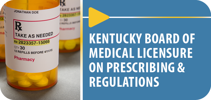
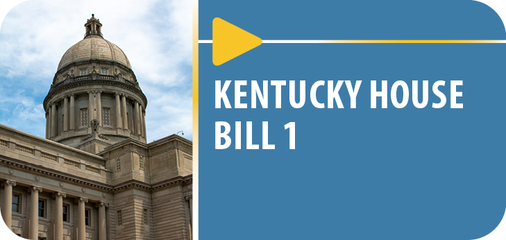
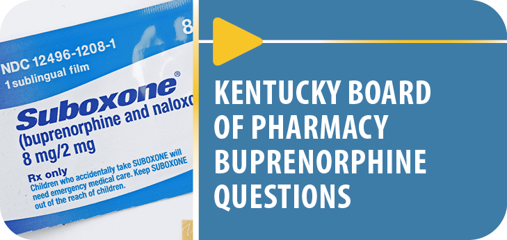
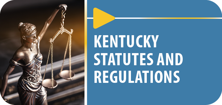
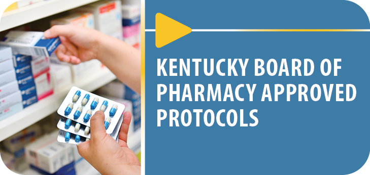
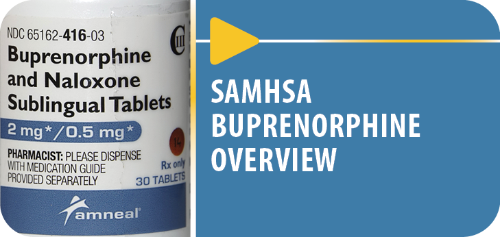
Website button suite — 6 module variants