Nonprofit Communications · Graphic Design · Event Marketing · Web Presence
Recovery Café Lexington
A warm, community-first visual presence for a peer-led recovery space and its signature fundraising events.
Translating RCL's warmth, energy, and community-first values into design that connects.
Recovery Café Lexington is a peer-led, peer-run community space for people navigating every pathway of recovery — from substance use and mental health challenges to housing instability and beyond. My work with RCL spans their web presence and two signature fundraising events, translating the organization's warmth, energy, and community-first values into design that connects with members, donors, and the broader Lexington community.
Approachable and warm, but clear and confident about who the organization is and what it offers.
RCL's website needed to feel as welcoming as walking through the front door — approachable and warm, but clear and confident about who the organization is and what it offers. The result is a site that leads with community, surfaces services without overwhelming, and gives prospective members, volunteers, and donors an immediate sense of belonging.
The design work centered on visual hierarchy that guides visitors naturally from mission to membership to giving, with photography and color choices that reflect the real, joyful community at the heart of RCL's work.
Website screenshot — scroll to view the full page
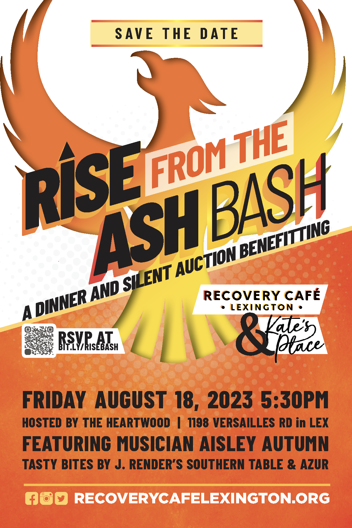
Celebratory, elevated, and tied directly to RCL's phoenix identity.
The Rise from the Ash Bash — a dinner and silent auction benefitting Recovery Café Lexington and Kate's Place — required a design that matched the occasion's ambition. This was a milestone fundraising event, and the materials needed to signal that: celebratory, elevated, and tied directly to RCL's phoenix identity.
The event banner and save-the-date card share a unified visual system anchored by the phoenix mark, bold typography, and a warm orange-and-gold palette. The save-the-date delivers full logistical detail — date, venue, entertainment, food — without sacrificing visual impact. Together, the two pieces gave the event a presence worthy of the community it was built to celebrate.
Bold enough to stop a scroll, polished enough to work as a physical postcard.
RCL's first annual Halloween 5K called for something that could live in two places at once: bold enough to stop a scroll on social media, and polished enough to work as a physical postcard. The Monster Mash & Dash identity leans into Halloween energy — silhouetted runners, pumpkins, a full moon — while keeping the Recovery Café Lexington brand centered and legible across both formats.
The Facebook timeline post and promotional postcard share a cohesive visual language while each doing their own job: the social post built awareness and excitement, while the postcard carried event logistics clearly enough to pin to a refrigerator.