Case Study · Campaigns & Copywriting · Brand Identity · Harm Reduction · Community Engagement
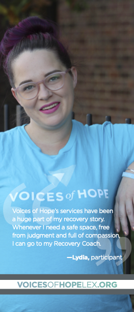
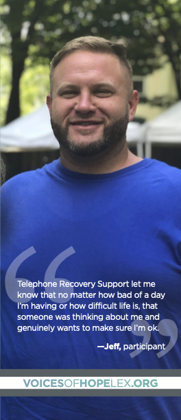
Voices of Hope
Five years of work with one organization — first as Community Engagement Manager on staff, then as a creative partner. What happened in between shaped both.
Eighteen months growing a recovery community.
I joined Voices of Hope as Community Engagement Manager in January 2019. VOH is a Lexington-based recovery community organization offering peer support, harm reduction services, recovery coaching, and community programming. They were growing — and that growth meant expanding their communications, community presence, and programming.
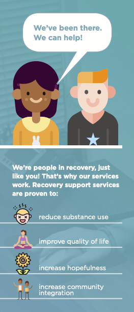
That last part mattered. I am a person in recovery. I came to this work not from a social work degree or a nonprofit career track, but from lived experience with substance use disorder and a belief that people in recovery are the experts on their own lives.
The role was equal parts creative and community-facing. I ran VOH's marketing strategy, wrote campaign copy, and produced print and digital design materials. I also developed and facilitated harm reduction programming and peer support training materials, coordinated community partnerships, and managed VOH's social media presence. I was the planner and co-chair of their annual Overdose Awareness Day event, and I facilitated public overdose response trainings throughout my tenure.
Bringing joy and connection into recovery spaces.
VOH had a strong foundation — a distinctive slate-and-teal palette and a recognizable mark. I worked with them to expand that foundation into a full visual identity that could carry across print, digital, apparel, and physical spaces.
I wanted to bring the joy and playfulness of Matisse's work into recovery spaces — bodies in motion, color as warmth, community as something you can feel in a room. The poster art translates that energy into VOH's visual language: the first piece uses bodies to make the abstract literal — recovery is physical, relational, embodied. The second is more intimate, about identity.
These designs became t-shirts, posters, and art inside the center itself. Thousands of prints have moved through the recovery community in Lexington.
"When we connect, we recover" is campaign copy I wrote for VOH — a line built to anchor their public-facing identity and give clear language to their peer support model. It wasn't a tagline someone's marketing firm handed them. It was copywriting rooted in the work, designed to carry the organization's voice into every piece of material they put into the world.
Bringing Harm Reduction values to recovery spaces.
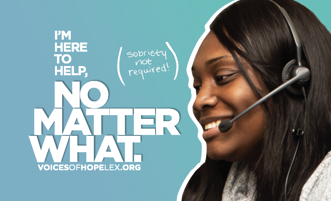
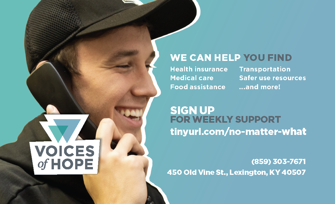
No Matter What is a harm reduction campaign — built on the principle that Harm Reduction is a valid pathway of recovery.
VOH is a recovery community center, and their communications reflected that identity. But they wanted to reach people who were still using drugs — people who might not see themselves in recovery-focused messaging. The No Matter What campaign expanded VOH's public voice to say clearly: you don't have to be sober to get support here.
I developed the campaign concept, wrote the copy, and designed the materials. "Sobriety not required" is set in handwritten type directly on the flyer — a deliberate design choice that separates it visually from the rest of the layout and gives it the weight of a personal commitment.
The flyer centers a peer specialist at work — headset on, warm, focused. The headline is large and unambiguous: I'M HERE TO HELP, NO MATTER WHAT. The service list on the left is practical and non-hierarchical. Everything points to a URL and a sign-up link.
The design principle: the image does the emotional work and the copy does the informational work, and neither gets in the other's way.
Connecting people to each other — and to services.
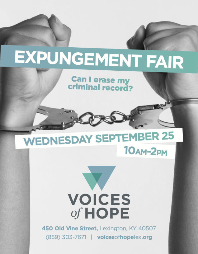
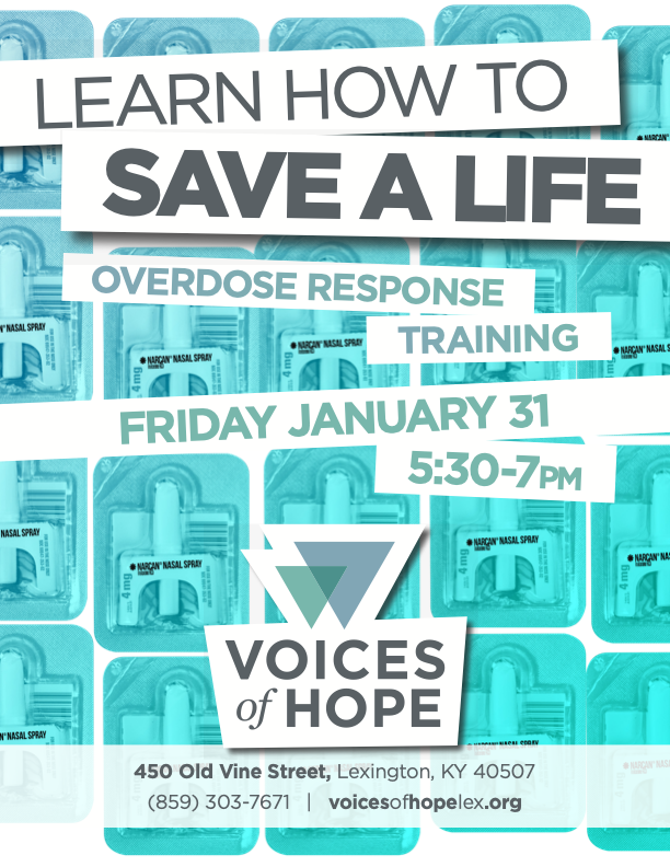
Community engagement at VOH meant showing up where people already were and making sure the right people knew about events designed for them. These flyers are part of that work — each one built for a specific event, a specific audience, and a specific ask.
Expungement Fair. The Expungement Fair connected people with records expungement resources. The design had to communicate access and dignity, not bureaucracy.
Overdose Response Trainings. Kentucky was in the middle of a sharp increase in accidental opioid overdoses. Narcan access was still limited. The flyer design emphasizes the medication intentionally — even if someone never attended a training, seeing this piece meant seeing Narcan: what it looks like, what it does, why it matters. Due to the work of Voices of Hope and other community organizations across the state, overdose deaths in Kentucky have dropped for four consecutive years, falling roughly 50% from their 2021 peak.
Each piece uses VOH's brand palette and mark. Each has a different compositional energy appropriate to its audience. Every one of these events was a point of contact between VOH and the community it serves. The marketing existed to make sure people found them.
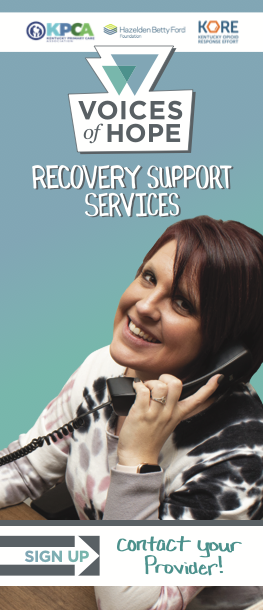
A brochure built for two institutions and one shared goal.
Voices of Hope has a partnership with the Hazelden Betty Ford Foundation, one of the largest addiction treatment providers in the country. I designed a collaborative brochure for that partnership — a piece that had to navigate two brand systems, two institutional voices, and a shared commitment to continuity of care, and make all of it feel like one conversation.
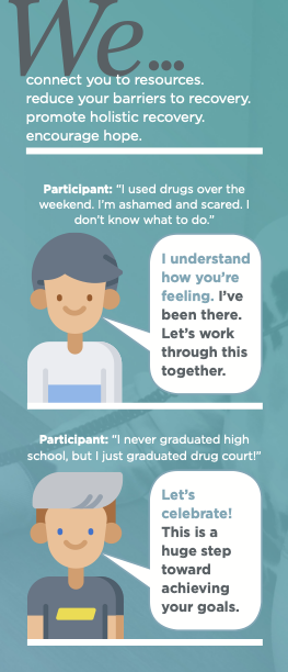
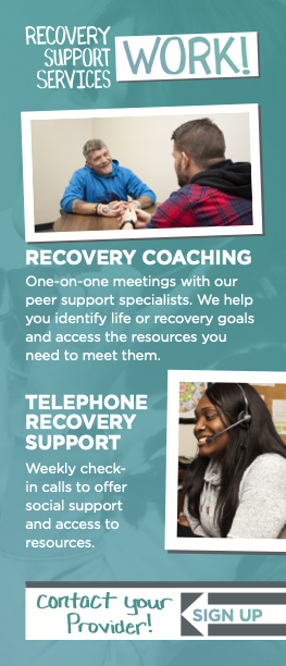
The brochure frames the partnership around the continuum of care: what happens when someone leaves treatment, how peer support bridges the gap between clinical care and sustained recovery, what VOH offers that a national treatment provider doesn't. It's a piece aimed at treatment counselors and discharge planners as much as at people in recovery themselves.
I also designed the Recovery Support Services marketing deck — a PDF presentation VOH uses with healthcare partners, referral sources, and potential funders to explain their peer support model and service capacity.